You have the glaring website improvements to be made, and then after that, most any we make are based on guesswork with a sprinkle of bias. Even best practices for website content are pretty dysfunctional.
The more I work on systemizing content recommendations, and thinking about contextualizing related decisions, the more I realize just how messed up the status quo iz.
Like “refreshing content.” The best practice? Find something that used to generate traffic (which no longer does), and then sink more into it it by adding new information, content, maybe some adjacent keyword phrases.
Best case you get a short-term freshness bump that dissipates in a few months. Worst case, you get hit by G after crossing some threshold for over-optimization. Of course there are exceptions that prove the rule. You know the case studies that we read and then try to replicate, perpetuating the myth of the freshness as best practice.
How we typically solve for having too much content:
- A web developer might suggest you “delete” most of it. For them it’s a hassle, out of scope.
- Your SEO might say it’s okay to have a lot of content as long as Google can access and index it. For them, it’s sacrilege to forfeit organic traffic, even if it’s useless.
- Your Hubspot loving content marketer will recommend linking related articles together, and yet, when pressed has no real process or reasoning for how this should be done.
- You might add a live chat or funnel popup if users have trouble navigating your content, essentially offloading your website’s job to a person or chatbot.
- You might improve your site search, but expensive to implement and solves for a tiny fraction of traffic inclined to use it.
Thoughts on how we could better solve for too much content:
- When you seek to improve traffic and conversions without focusing on better website content structure, you’re ignoring the richest data you have, your website, and yet we always ignore improving structure when solving for traffic and conversions.
- Improving visibility on your existing content is marketing in and of itself. You are saying, “hey, did you see this important thing I made for you when I was thinking about this very specific problem I know you have.”
- Your website provides the context in which you can evaluate content in light of other pages, traffic and conversion data. Without the context on the site, you have nothing to compare those metrics to. Let’s say your most viewed article has been linked from your homepage as long as you can remember. Is it your most viewed article because its linked to on your homepage? Or because of something else? How do you compare a well promoted page to a deeply buried page?
- Unfortunately, its 2021 and yet you are stuck looking at a data summary on a per page basis over time or maybe watching a specific user’s session recording. It is too hard to drill down into the paths of visitor’s experience that led to a positive experience or action and also have the context to compare it to anything else. You could create these flows, but they you can only look at them one by one.
- Prioritizing what’s important means knowing what goals you have, what outcome you are seeking, and then identifying what might be most important to that, and creating decision making criteria accordingly. Your previous bias towards or against some content you created left out of it.
What to do with all that old content?
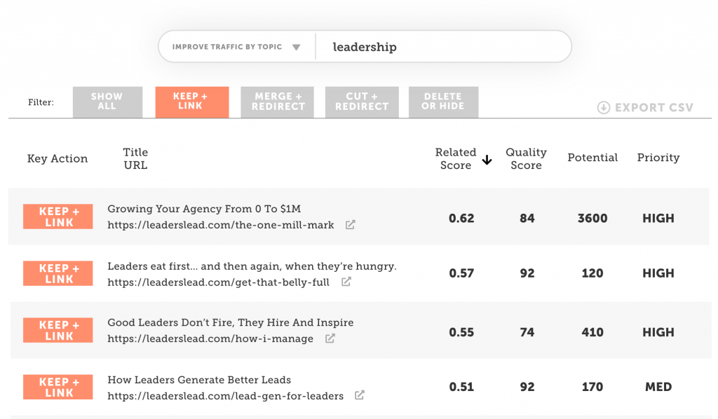
Keep, merge, redirect, or delete? (aka Feature A)
I mentioned in that last email, I do this with spreadsheets for clients, but I want you to be able to know how to prioritize what content to do what with.
In order to get there, we need to be able to “project a graph,” basically predict how lots and lots of future changes would impact the KPIs you care about, and then return a list of the most influential positive results in a way that you or a resource can chip away at.
What pages are structurally optimized for what topics? (aka Feature B)
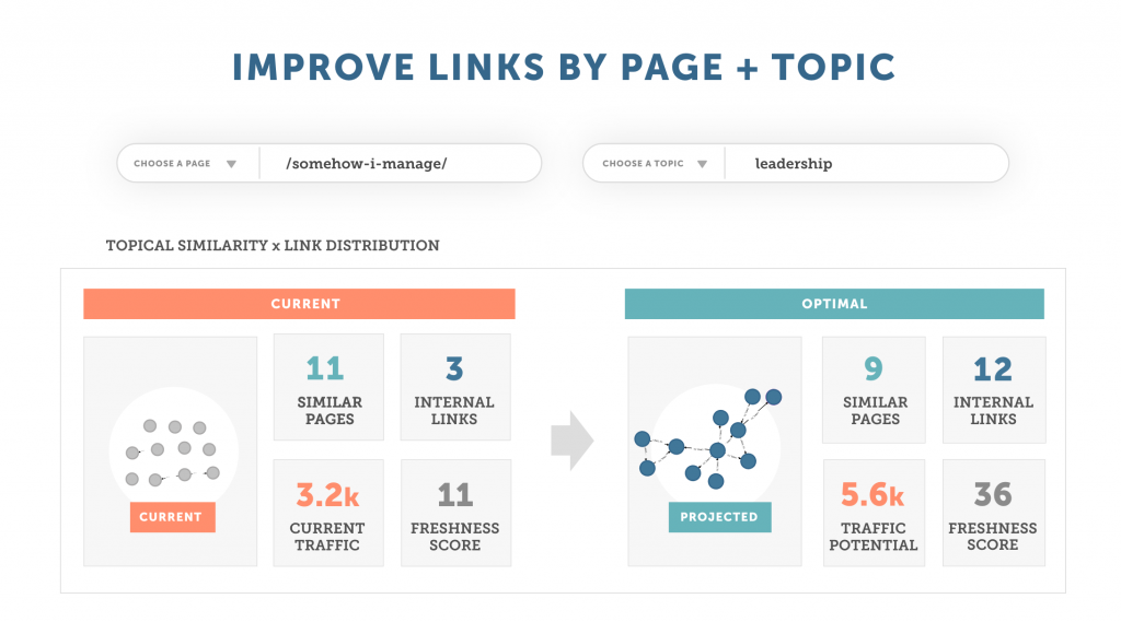
I said last week, I want you to be able to pick a topic and a page and get a sense of where your internal linking stands for that article around that topic cluster, and what a more optimal internal linking structure might look like.
The sad thing about humans is the 5 plus or minus 2 registers problem, ie. we can juggle thinking of about 5 things at a time. For me its more like 3. This feature is being designed to account for how teams typically approach content marketing and content improvements (ie. one goal for one page at a time).
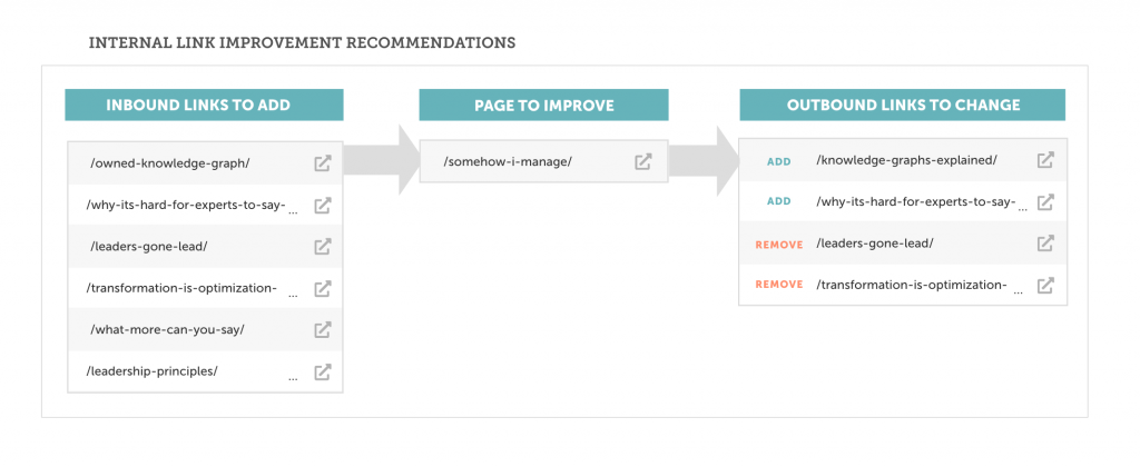
Then for drilling down into what to do on that page by page basis to get from “current” to “projected” in the above columns, that is, optimized internal link profile for a page, we have the inbound and outbound links to update as a punch list:
What groupings of pages are similar structurally? (aka Feature C)
The problem with graph visualization, or data visualization in general, is knowing what to look at, and what the takeaway should be. What can someone “see” to get a sense of a bigger picture and then how should they “act” on that.
So how do you get an actionable info in an aggregate of pages?
It’s great that we can focus on improving one page at a time because that’s what we’re used to doing. But how can we cheat our way to thinking about 30, 50, 100 things at a time? Or being able to “chunk” work by improving pages that matter with similarly weak link profiles, or fixing similarly overly linked to pages that don’t matter, or
This is one I was working through as a reporting concept with the talented Paul Swail who has been helping me with the application architecture.
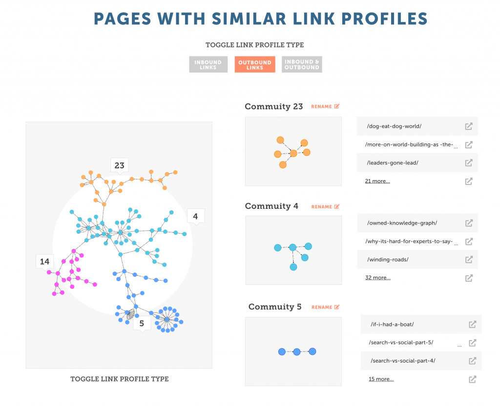
It’s a visualization of the inbound and outbound (internal) link graph segments of pages with those same inbound / outbound link patterns in aggregate.
To take a step back, we can visualize a page’s structural context by thinking about its inbound and outbound link profile. Imagine a page you care about. It is on your blog. It’s referenced in and linked from three other articles. It also links out to an older article that is mentioned and a call to action’s landing page for a service you are selling.
Upon further investigation, you see that a handful of your best performing pages have this approx. structure. It’s a common pattern in your articles when you’re on fire with your thinking: connecting dots between ideas, almost naturally optimizing posts in the sense that they are linked to from a few relevant sources, and they are connected clearly to a call to action, a meaningful framing for you to remember why you created this piece of content and what’s its purpose should be going forward.
You realize more of your content should be accessible, even amplified like this.
I mentioned last week I’ve been busy working on workflows for the content recommendations.
Other recent posts:
