I have been rambling about blog organization forever now. If you’ve been putting up with that, thank you. This post focusing on usability and the next focusing on search, I think, will really make it “click” as to how powerful this concept can be.
We’ll be doing a quick review of how two experts in personal/professional development space handle organizing their blogs and structuring their category pages.
jamesclear.com vs tim.blog
I’m a big fan of both Tim Ferriss and James Clear. They’re both successful best-selling authors, entrepreneurs, and thought leaders on similar subject matter.
But the their sites’ content organization and the resulting organic traffic differences is in stark contrast.
Organization and navigability
This comparison ignores some key differences, which I’ll discuss at the end.
Tim.blog uses a sidebar category list
Tim.blog is a traditional reverse chronological blogroll with a sidebar. It dumps the latest posts and podcast episodes in order.
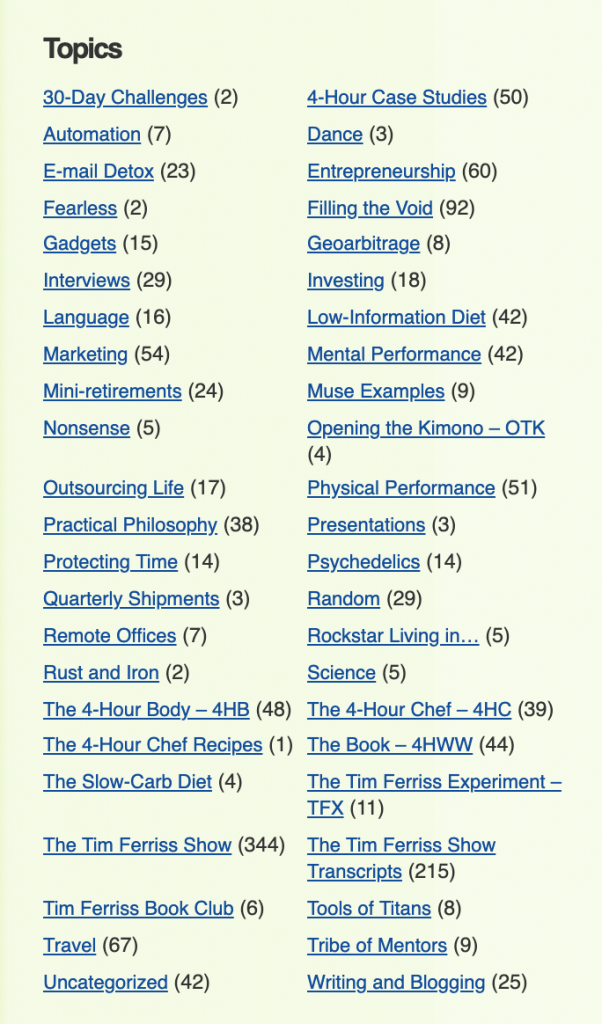
Looking through some of the topics, I’m not sure what some would lead me to if I clicked – eg. “Fearless (2)”, “Nonsense (5)”, “Random (29)”, “Uncategorized (42)” etc..
jamesclear.com/articles uses a no-sidebar curated list
Jamesclear.com is a very minimal personal brand style site. You get there, you see his latest book and an open letter type blurb about the site.
The menu is clean and when you click “Articles” you get a nice intro about the page being a curated collection of his best articles and this:
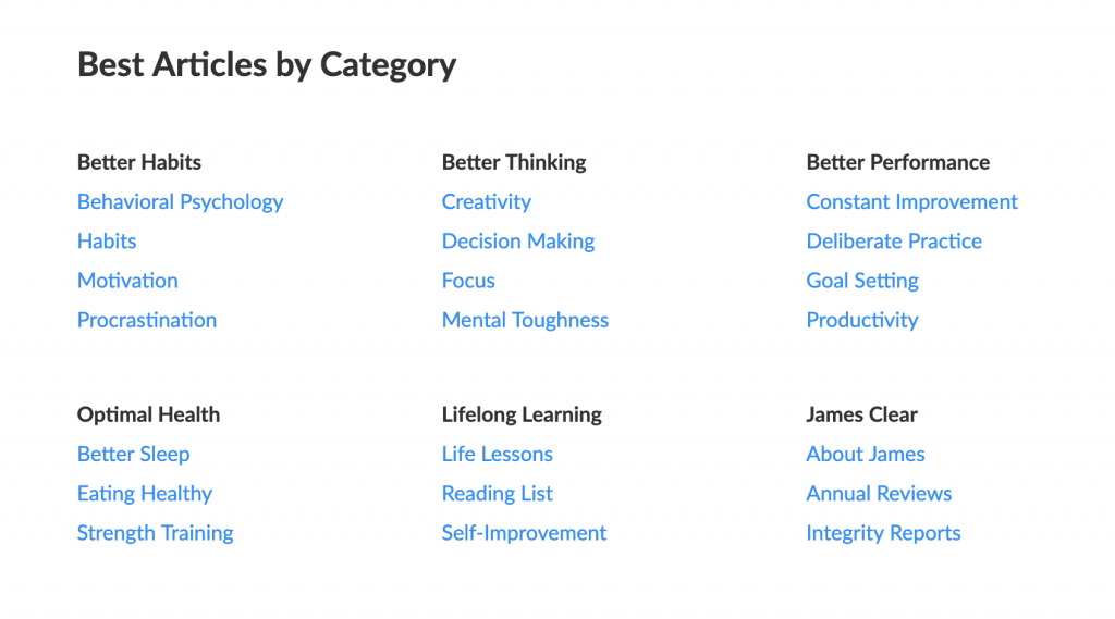
This is incredibly well thought through and organized.
I can see six sections, each with three to four categories. I could get where I wanted to go in an instant and James would know that as a user I self-selected my interests. If he wanted/does track this for signups, it would be a good tag to segment me.
After the sections, the full catalog of articles are listed reverse chronologically (which he states in the intro paragraph so you don’t miss it).
This is great for crawlability (he only has a few hundred) and helpful for returning users to see what’s new.
The above images are both scaled to 50% their default screenshot size.
Respective “category” pages
Tim.blog uses a traditional category archive list

This is pretty standard. I wouldn’t be surprised if this was the default category.php file used in WordPress.com VIP (custom) themes. It simply outputs the thumbnail and title of each post reverse chronologically.
Jamesclear.com uses a curated guide format
We could actually spend a lot of time on a few of the category pages. For one, they all have guide style titles:
- “Behavioral Psychology: What It Is and How to Use It”
- “Grit: A Complete Guide on Being Mentally Tough”
- “The Habits Guide: How to Build Good Habits and Break Bad Ones”
- “The Decision Making Guide: How to Make Smart Decisions and Avoid Bad Ones”
Let’s pick /motivation as our example. Here’s the structure:
- title: Motivation: The Scientific Guide on How to Get and Stay Motivated
- intro paragraphs: blurb about motivation, what this page is, how to use navigate this page
- in-page menu with anchor shortcut links (“Johnson Box”)
- three sections of content on category concepts
- inline links to specific pages within the category as appropriate
- list of all articles in the category
- list of other similar/related categories
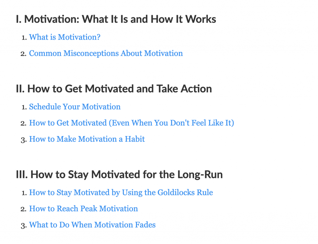

There are three things I want to unpack here:
- At each step, he’s telling the reader exactly where they are, what to do next, and how they can navigate around.
- The category isn’t just a checkbox on his blog post. It’s a guide to that topic with internal resources listed.
- He clearly demonstrates authority on the category at every step by wrangling the category into a framework the user can rely on and linking to authoritative posts on key ideas.
If you have a couple hundred posts or more and care about your search traffic, you’ll definitely want to see tomorrow’s post where we go over who gets more search traffic and why.
As you can probably tell, I’m a fan of jamesclear.com organization in terms of navigation and usability.
But it’s not just me. Let’s take a look at how Google feels about it.
tim.blog Google US Desktop traffic (semrush)
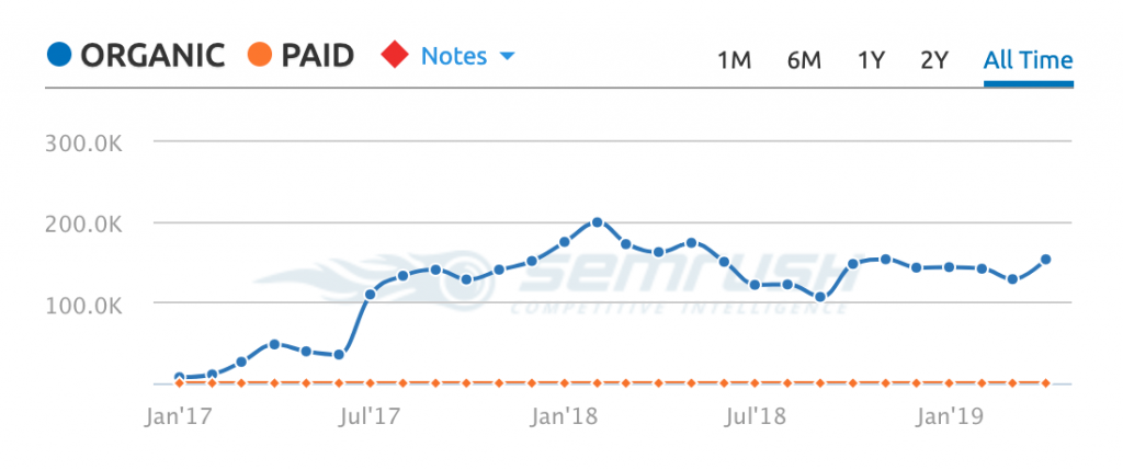
jamesclear.com Google US Desktop traffic (semrush)
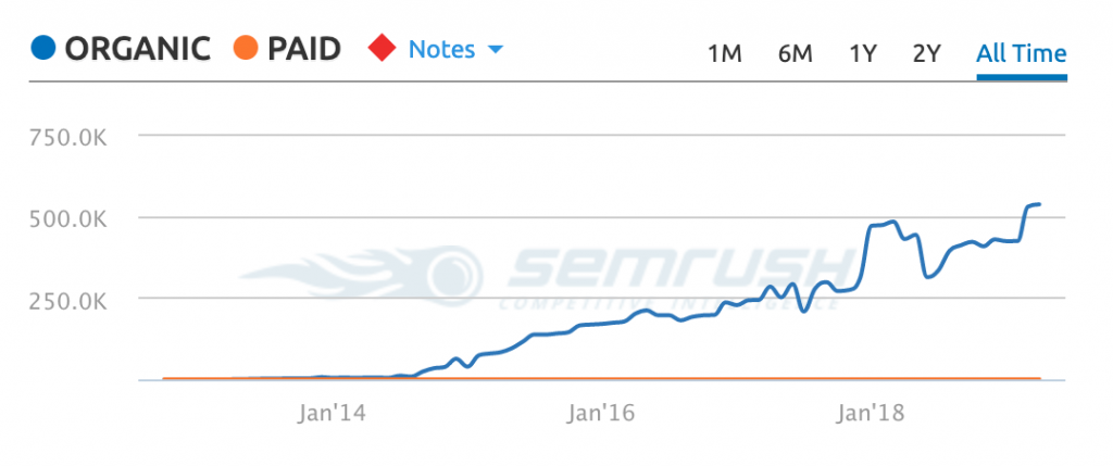
Rankings for each site
tim.blog Google US desktop top rankings
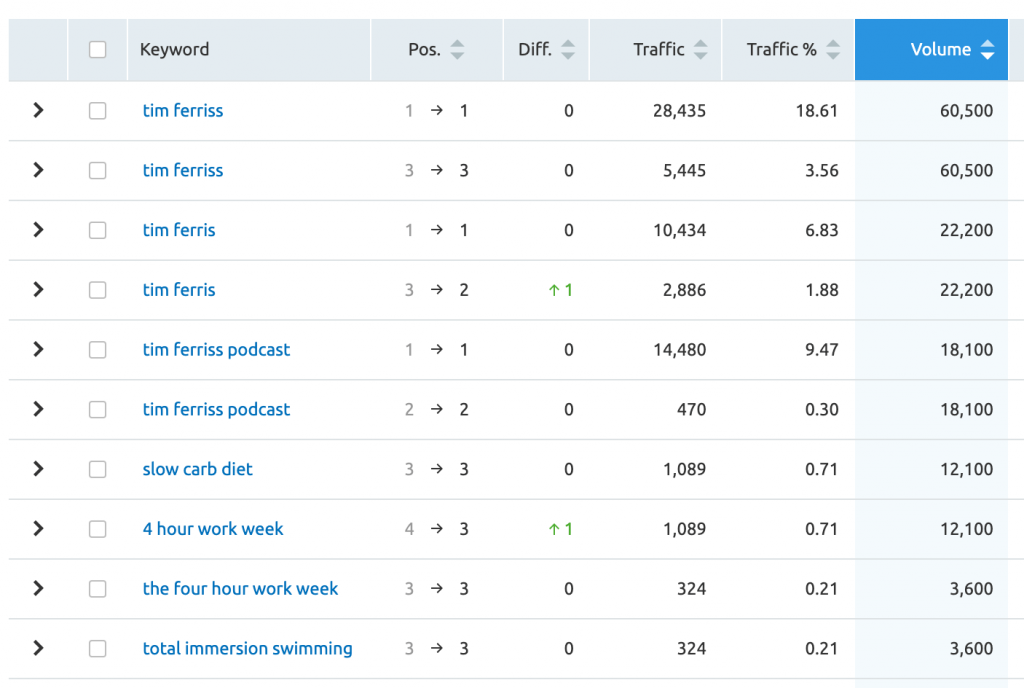
Eight of the 10 highest volume searches where tim.blog ranks in the top 3 are branded queries related to Tim’s name or book.
Maybe you wondering how well his category pages do rank?

As far as I can see of the 213,739 keyword phrases he ranks in the top 100 for on Google US Desktop, only two of them are /category/ pages and it looks like by accident on the 3rd and 8th page of Google.
The number is so low, I actually had to double check that tim.blog wasn’t telling search engines not to index those pages.
james.clear Google US desktop top rankings
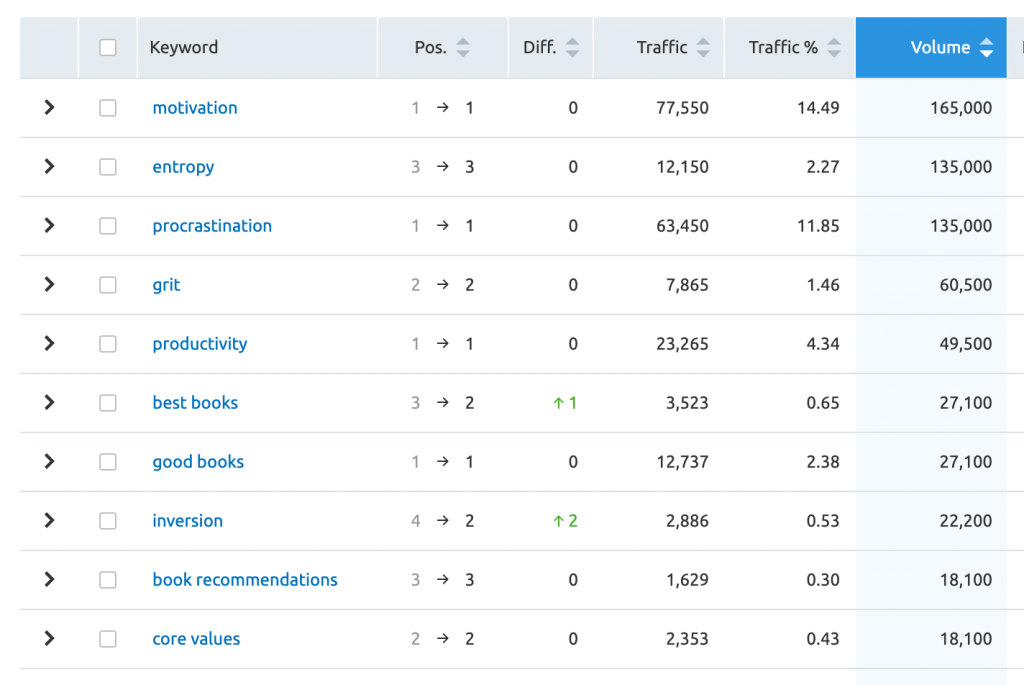
For James Clear’s site, you can see that of the top 10 highest volume queries he ranks for a series of the names of the category pages made into curated guides.
To rank first for so many terms is not a coincidence:

Other mediating factors to consider
Now I should mention a few things complicating this comparison:
Multiple blogs and partial migrations can lead to issues
Tim has had two blogs before tim.blog launched and fourhourworkweek.com (the second one) is still technically active. Even though most pages redirect to tim.blog, there are pages still being indexed in Google.

Instead of looking at this as an a disparate issue, I would say this is just another symptom of the same problem. Multiple blogs demonstrates a lack of planning and organization more than it excuses it.
Now Google is left to piece together the relationships between the entities of Tim Ferriss the person and his top selling book. Being not 100% sure what pages on what sites to rank for what queries means Google will probably just serve a “safer” result for those types of queries.
James Clear’s site is kept incredibly tight from an internal linking standpoint
There are no excess links or dynamic pages like /tag/random/page/4/ everywhere. In fact, most of his non-post pages aren’t even internally linked to except in the sitemap xml file.
The site is curated guides with links to all his best articles, the best of the best linked the most frequently.
For primary content type, Tim Ferriss is more focused on podcasting
Tim Ferriss’ content format of choice lately is podcasting and he has an insanely large podcast audience. The short version of why content format matters is, compared to text based content, podcasting is bad for (your site’s) SEO.
Given how pervasive he is, he probably isn’t losing sleep over the couple hundred thousand visits a month he could be getting from search. But it does seem like just the kind of thing he could give himself a 30 day challenge to change and see some outsized returns.
For this content series, here’s where we’re at:
Content audits with pattern recognition exerciseFrom automated archives to curated hubsNavigability users and search engines alike love- Aligning calls to action with key content
- Identifying and fixing content issues (dynamic content, etc)
- Content pruning decision tree
- Changing, moving, migrating things the right way
- Quick and dirty user testing
I’m also thinking about including a post or two on E-A-T (expertise, authority, trust). Or exploring/researching how Google might treat relationships between entities as a measure of trust and writing on it after this series.
