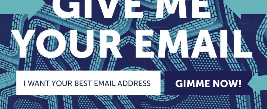
Seeing my last email in my own inbox, entitled “don’t be basic with your content,” felt a little… mean? weird? annoying? I don’t know. It just didn’t feel like the kind of subject lines I want to be writing.
Ann (wife) said it seemed fine, but then again, she helped me write it.
And then again, she is the kindest person I know so she would be the best judge there. So I won’t awkwardly apologize about an email subject line slash blog post title but it did make me think.
Are you familiar with the dark UX pattern called confirmshaming?
Dark UX is just a term to describe manipulative design practices that put a company’s interest over yours as a user, often without your awareness. Like Amazon “giving” you a free month of Audible only to automate a monthly subscription thereafter using your card on file.
What is this confirm-shaming?
You know those popups subscription CTAs where the option to close the popup is worded in a negging or backhanded way to the user?
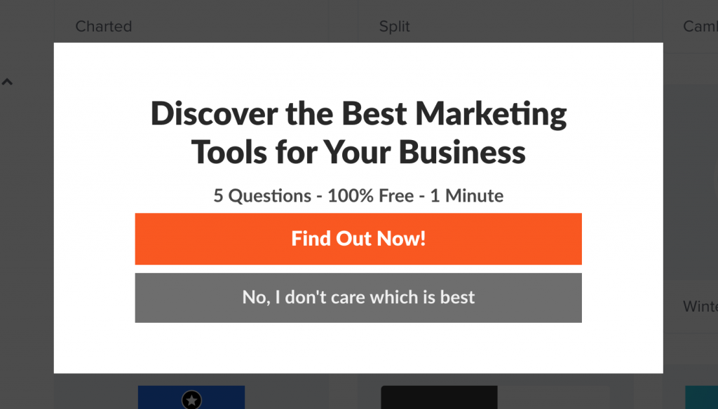
They’re pretty common.
For coupon offers, they might say, “no thanks, I don’t like free stuff.” Or for email opt-ins on a blog, they might say something like, “no thanks, I already know everything about *some topic*.”
They can be subtle too:

Some 37 pages of examples at this tumblr, including my favorite, “no thanks, I already know everything about gardening.”
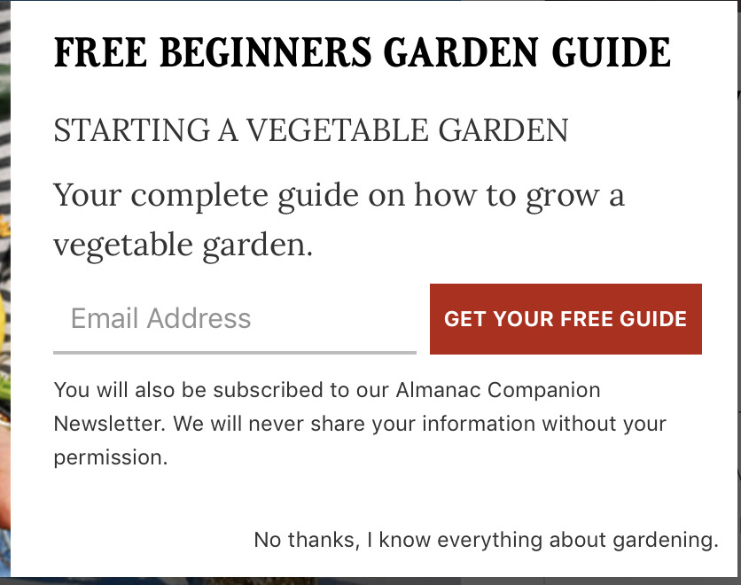
Who knew gardening bloggers could be so lippy?
How it works
The idea is two-fold.
First, force the user into an action.
Second, make the user choose between taking the action you want them to (providing their email address) and an alternative that invokes a sense of shame.
Optionally, add in another layer of forcing more consideration and attention on the user by making the choices not 100% clear.
While people just want to exit a popup and continue what they were doing, now, instead, they have to read the options to determine which one is the exit option.
As you can see in the gardening example above, the Exit option is hidden in plain text without an underline to call it out as a link or button. In the marketing popup above that, the buttons are the same size and close together.
It may seem like nitpicking, but when users are trying to close something as quickly as possible, it’s a battle for those additional milliseconds of attention on an offer and you can’t shame someone if they don’t see it.
Why this has become so prominent
The problem is that this, and a lot of little marketing tactics like it, are treated like best practices, because, “they work.”
I made a one time purchase for a popular popup SaaS when it first came out. Flipping through their templates, I found a few with default confirmshaming text.
So garden blogger guy probably isn’t a total punk, they just edited some placeholder text adding the word, “gardening.”
The future of email opt-in popups and tactics like it are tied to the stakes
These popups “work,” just not as well as the previous year. And last year, they didn’t work as well the year before, etc., And even as effectiveness decays over time, they are still “effective.”
Even as time goes on, they still “work.” You just have to get more aggressive about it
So many just double down: make the popups happen more quickly, more frequently, in more ways – slide in, pop up, from the corner, full page takeover, add more confirmshame, etc.,
While email opt-in popups annoy 100% of people, they often result in 0.5% to 50% opt-in rates.
If you could show a popup to your next 10,000 users and generate 2,000 email signups, how hard would that be not to do?
Now if you could add a tiny confirmshaming “no thanks” type thing to add another 30 to 50 emails a month, would you?
Now imagine your business isn’t doing great, or that a lot of things you’ve been doing that have worked don’t work as well: launches, webinars, ad revenue, affiliate channels, etc., and you have to decide between going back to work for the man or making some changes.
When the value of a subscriber is somewhere between $5 and $25 per year, you could be looking at thousands a month in lost revenue from not using these popups.
That’s a hard business decision to make.
Add paid traffic to that mix where every penny counts to get to good return on assets (ROAs), and it’s very tempting to add a little shaming copy.
Looking at the past five years of using opt-in popups for clients, I’ve seen the numbers come down. For our “best” one, a quick and dirty lead gen site for a real estate team, it’s down from about 42% to 11% opt-in rate over the past three years.
Every 10th to 20th lead can be worth $5k to $20k in commissions. So even if the opt-in rate is 0.1%, I can’t imagine them giving it up.
You can’t compare the clear short-term benefit with the unclear long-term harm
What you don’t see though, is the ~90% of people that were micro-offended or micro-annoyed and that association got paired with your brand.
You’re trading the kind of subscriber that can be shamed into providing an email with the kind of subscriber that can feel respected and build a relationship with you over time. It’s a completely different mindset.
You’re building expertise through content for an audience. You can’t do that without a 5+ year commitment. And you can’t do that by annoying the vast majority of people that come your way. It’s clearly not the way to build momentum in repeat sales and referrals.
But we never see those numbers.
More examples:
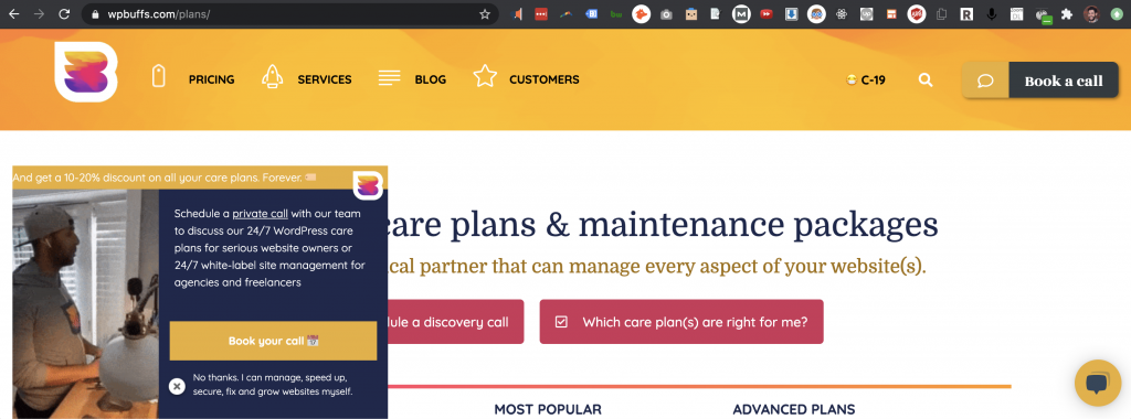
WP Buff’s approach to confirmshaming
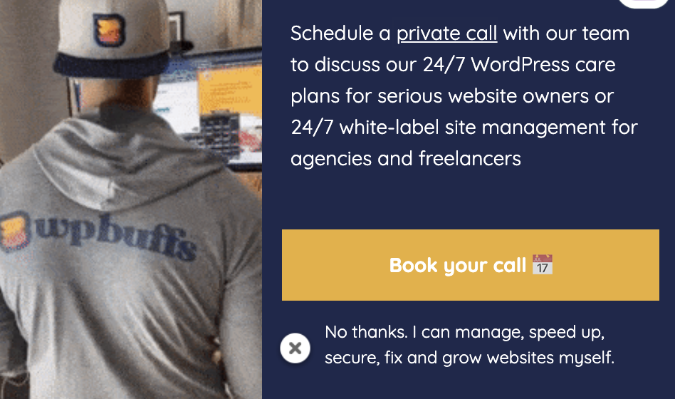
“Schedule a private call” OR “No thanks. I can manage, speed up, secure, fix and grow websites myself.”
