For the past 2 years or so, I’ve been on this long strange trip around “organizing lots of expert website content.”
It is a weird specialization but the more I dig in the more depth there be. I also get to borrow tools and models from all my favorite acronyms: SEO, CRO, UX, IA, NLP, and fields like design research, network science, information science.
Recently I’ve been focused on how to collect, visualize, and analyze data to create actionable knowledge. Actionable as in it provides a decisive, defensible structure for information, knowledge as in its based on the right inputs to optimize support of website users.
For example, it would be actionable knowledge if we could answer this question: given the sheer number of searches users may use to arrive at your website, the users’ goals and the goals of your org as it relates to those users, how should you structure a /resources page?
This is actually a really hard question to answer well in a given context — lots to unpack, searches that are dynamically changing, many unknown to us, with a limited number of actions they can take that have business value. we want users to take. Also, the more important to the org the actions are, like making a big purchasing decision, the more complex the buyer’s journey becomes. So that also require lots of inputs beyond your org, such as reviewing competitor offerings, marketing, non-direct competing alternatives, and often most overlooked and underserved, the actual inner thinking of the users pursuing a purchasing decision themselves…
*deep sigh*
Mental Model Diagrams… to the rescue?
If you’re not familiar, Indi Young developed an approach to creating knowledge through a form of qualitative research she’s cultivated over a lifetime called problem space research. One of the key outputs of this type of research is a mental model diagram.
It’s… complicated, but potentially world changing for you if you can wrap your mind around it; so I will attempt a short description.
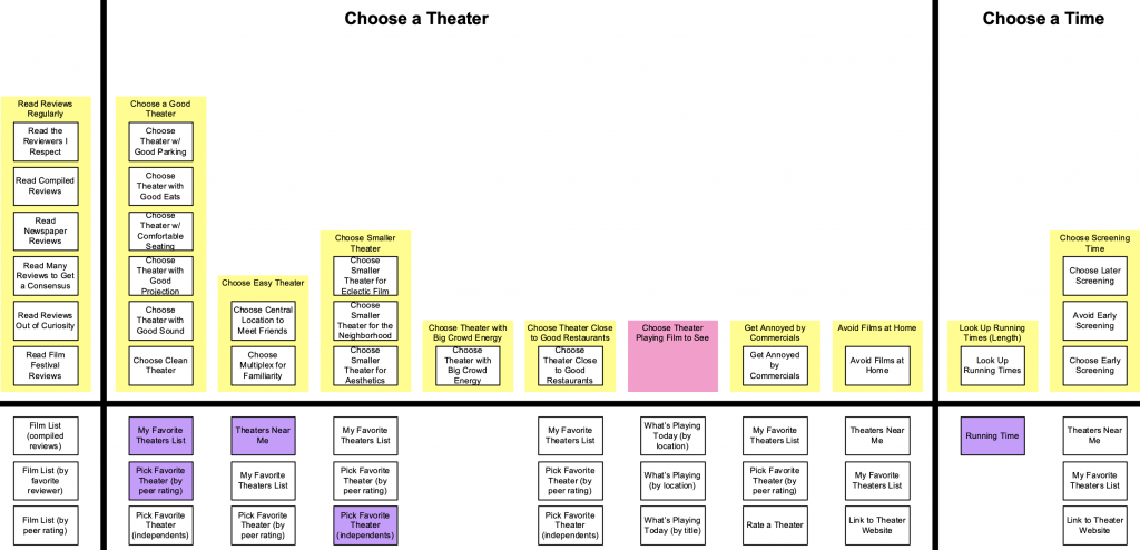
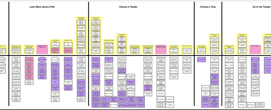
Zoomed out, it’s the top half here and as Indi would say, it looks like a cityscape:

Zoomed in, you see “blocks” with “towers” that make up stacks of “summaries.”
The summaries are the distilled concepts reaped from the inner thoughts of participants collected during “listening sessions.” Distinct from “interviews,” which implies a directed line of questions fraught with bias, these sessions seek depth in the inner thoughts of a person around a relevant purpose following a loose format of, “what went through your mind the last time you did x?” Participants are carefully recruited and screened so we know upfront they have done a lot of thinking on “x” topic.
The mental models, the resulting diagram’s towers show natural patterns that have been uncovered throughout inner thoughts of all participants thinking about that last time they did “x.” At minimum you need 10 one-hour interviews listening sessions! and about 15 hours to process each session hour. So this is a 150+ hour study to run.
In the example, “x” below is “going to a movie.” A step or natural grouping shown here is the “choose a theater” block, with “Choose a Good Theater” as the first tower made up of a stack of summaries. Under the black horizontal lines are other types of data, basically whatever we want to put, but often its a way to do gap analysis and identifying how much opportunity there is to support these surfaced patterns of needs.
The bottom half squares could be ways these towers of common inner thinking are currently supported, or brainstorming of ways they could be better supported, or how competitors support these, some mix distinguished by sticky note color, or literally however an organization decides to use the mental model diagram to generate new knowledge rooted in the reality of the array of how people think when they are doing a thing.
I recently asked her if she had issues with overlapping towers (a common thing in taxonomies). Her reply was something to the effect of, “these are the opposite of taxonomies.” Taxonomies being top down, enforced structure and hierarchy, while these towers emerge in stacks of thoughts and then natural edges surface between the blocks, or tower groupings.
My now hypothesis is that the blocks are eerily perfect natural breakdowns for an ideal potential structure of your website content.
Here’s my thinking: whether you are a soloist solving a niche problem or a horizontally integrated monopoly, anything a user pursues related to your organization’s goals to support them, if perfectly supported, would be optimally represented in your site. The ideal potential structure is when your website optimally supports the array of thinking patterns of people coming to your website given the real constraints (amounts of content, time, webpage real estate, etc..).
And so, in mental model diagrams, we have an artifact that reflects people’s different patterns of thinking about what we care about helping them with.
But the diagram is just that, a diagram. As soon as we put it away, or even zoom out, it’s out of sight/out of mind until we pull it back out, and drill down into a block of towers.
Loading mental model diagrams into a graph database
Before generating a diagram, the concepts and summaries are organized in a spreadsheet like so:
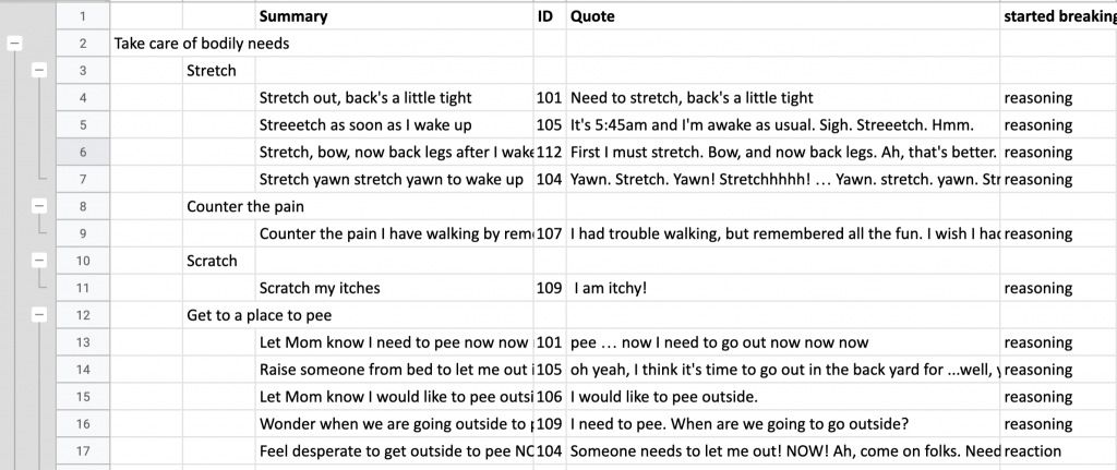
Then you can import that excel sheet into a tool (like Indi’s MMD Generator) to generate a diagram. The diagram can be imported into a visual collaboration tool like Miro or Mural, and added to.
Here is what the Eat, Smell, Prey MMD looks like:
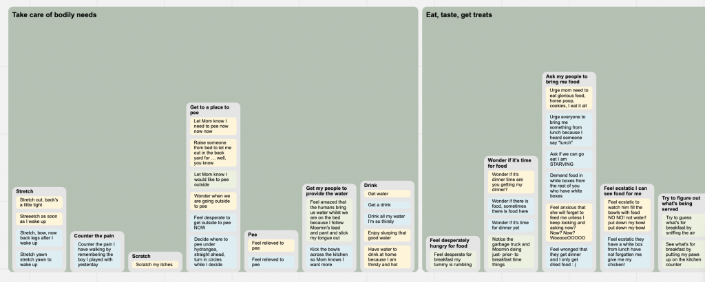
But now that data is stuck in that format. As we add and split towers as more patterns emerge over more studies or time, we have to regenerate and re-apply our notes, insights, supporting things below the city line.
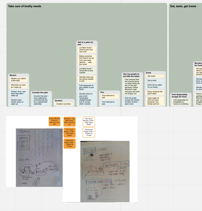
In graph databases, you can import CSV data pretty easily as long as you know the “data model” you want it transformed into. Here are the steps I have:
- Convert the excel format to a CSV friendly format, where each row signals relationships exist between the cells (nodes) in that row.

In the above, we have our data in an importable format.
2. Model the data for import, mapping the columns to nodes and rows to indicate relationships:
3. Create constraints in our database so we are not loading duplicate data:
CREATE CONSTRAINT ON (b:Block ) ASSERT b.name IS UNIQUE;
CREATE CONSTRAINT ON (t:Tower ) ASSERT t.name IS UNIQUE;
CREATE CONSTRAINT ON (s:Summary) ASSERT s.name IS UNIQUE;
CREATE CONSTRAINT ON (p:Person) ASSERT p.id IS UNIQUE;
CREATE CONSTRAINT ON (q:Quote ) ASSERT q.name IS UNIQUE;
CREATE CONSTRAINT ON (d:Depth ) ASSERT d.type IS UNIQUE;
For quickness, I put the above into a text editor and saved as a mmd.cypher file in my import folder. Then loaded it with one APOC query: CALL apoc.cypher.runSchemaFile("mmd.cypher");
4. Load our CSV with our above data model structure
//Load MMD
LOAD CSV WITH HEADERS FROM "file:///dog-mmd.csv" AS mmd with mmd
    MERGE (b:Block {   name: mmd.Block })
    MERGE (t:Tower {   name: mmd.Tower })
    MERGE (s:Summary { name: mmd.Summary})
    MERGE (p:Person{ id: mmd.ID})
    MERGE (q:Quote {   name: mmd.Quote })
    MERGE (d:Depth {   type: mmd.`Type of Depth` })
    MERGE (b)-[:HAS_TOWER]->(t)
    MERGE (t)-[:HAS_SUMMARY]->(s)
    MERGE (s)-[:TYPE_OF]->(d)
    MERGE (s)-[:HAS_QUOTE]->(q)
    MERGE (q)-[:SAID_BY]->(p)
;
5. Check our data imported correctly – let’s filter relationships associated with the “stretch” tower:
Oh that looks good! But we can tune the data model to be even more clear, like “TYPE_OF” if changed to “THINKING_TYPE” would be more clear for reading, ie. “stretch yawn stretch” is a thinking type reasoning, vs type of reasoning which is grammatically confusing.
6. Next up… think about how we can query this graph to:
- make updating and deploying it easier for different purposes.
- apply network algorithms to uncover or substantiate relevant patterns
- do text analysis / NLP
- layer in our other types of data to this model so we can make it a living breathing thing
More soon hopefully..
What a joy to read this!! 😀
Back in the beginning (okay around 1998-2003), I used MMDs chiefly to derive navigation of web sites. I had to use something to see the natural edges (love that phrase). I also had to use something to convince stakeholders that their view from the inside is not the best view to use for user navigation, and the huge set of data reduced to a diagram was “convincing.” I would use some combination of blocks and towers, according to the org’s strengths, to derive the top-level navigation. Once we got more than a layer deep, it often started reverting back to taxonomies–but that worked because the user had found the level that matched their cognition.
So it’s really cool and satisfying to see your write-up about how it’s still useful today!