I was bummed I didn’t get an email out today, and then I remembered I had this draft just sitting there.
What’s interesting here isn’t actually the question, but how we can answer questions like it with this tool called BuiltWith. You can slice and dice adoption of trackable technologies across sites over time and filter by roughly how popular those sites are.
One of the things I’d like to do with the research project is look at what technology stacks audience-first businesses use, and if there are any patterns related to measures of success like traffic.
So here’s that post:
You know, the “share this” bars with 10 different social icons.
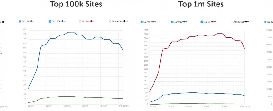
A bunch of sites still have them. I took a look at adoption of the more popular ones over time and the results are pretty interesting:
The higher traffic the site, the less likely they are to still have share buttons.
Here’s a popular example: Simple Share Buttons Adder plugin
Via Builtwith:
- 346,291 sites ever found using it
- 110,899 live websites using it
- 235,392 sites no longer use it (or no longer exist)

Builtwith shows amount of adoption in sites in the top 10k, 100k, 1m, and all internet. For top 1m sites, adoption peaked in 2016 or so, the slope of the curve of lost adoption gets steeper from 1m to 100k, and comparing 100k to 10k. But it’s actually increasing for the rest of the internet.
One plugin is not a perfect data point, but the trend holds for a lot of those share button plugins I looked at graphs for.
I’m assuming that top sites have learned it’s not worth putting a plugin on your site that links to 5 to 10 social sites on every post.
Further, it looks like people are searching for share buttons less and less:
So looking at adoption curves is interesting, but adding some other data like adoption by site traffic bucket, or proxies like search trends, can really help add some color.
