This is a basic site review requested for Homejab Mortgages. To get your free site review, feel free to contact me here.
First Impression
It looks like the first “get a quote” call to action, the three sections for purchase, refinance, get cash, and the get a quote call to action below those sections all point to the same first step of getting a quote. 
It’s also a menubar link. While there is no overt problem with adding multiple links to the same page on a page, it thins out the content on the site and misdirects users. Three of four pictures are image links on the page go the same place with different titles. Any user trying to explore the site is going to get frustrated continually being pushed to get a quote. Additionally, the description content doesn’t really match up with the headers for each section.
When It’s All About the Form

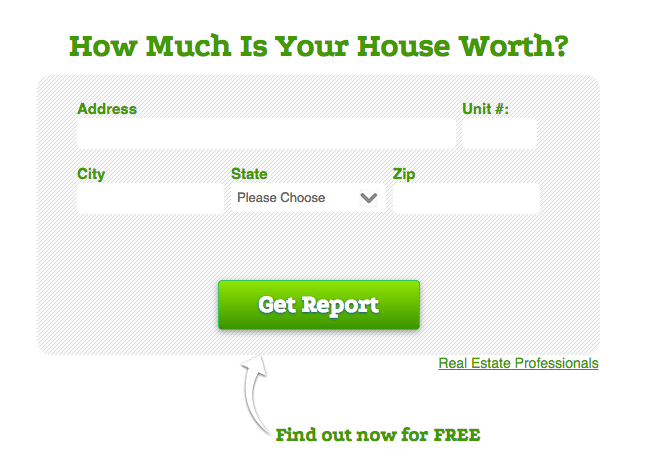
Why not put this first step of getting a mortgage quote front and center, above the fold on the home page? That would remove a step and unnecessary reading for people looking for instant mortgage rate quotes. One of the most conversion optimized pages I’ve seen is a Market Leader property at HouseValues, it might be worth walking through the steps on that just to see the language they use. ie. “Get Report” and then on the next page, it’s “Get Report Now.” Market Leader pushes tens of thousands of clicks to that page each month with Adwords and built their home seller lead business doing paid search on that page.

Related, you can remove another step by combining the second and third step since you’re only asking for employment information in the second step. I would still use the progress bar, but put it at 50% or 75% just on the second and final step indicating that the next button they press will definitely be the quote, ie. “See Your Best Rate Now”.
Foot in the Door Effect
If you’re not familiar, the foot-in-the-door effect is leveraged in sales, where getting a small yes upfront increases the likelihood of getting a bigger yes in a follow up.
By creating a shorter first step and longer second step, we can access this phenomenon with contact forms. By having the first step on the homepage with a “Get Report” button or something similar that implies it’s one step, you are getting them to make that first small commitment which will increase the odds of a second larger commitment (here finishing the form).
By removing two steps (here the first click to the get a quote page and the combining the second and third step) we are also limiting the risk of steps as points of abandonment, which is a major issue in conversions as the funnel, by definition, shrinks with each stage.
How I would layout a second section to your site
I think its important to demystify the process of using your site as a mortgage marketplace by clearly listing out some of the features/benefits of using the tool, and then asking them, “what are they waiting for?” with a shortcut link to the quote. I’d either put these next to the first step of the form or right below them.
Currently, the descriptive text under the “purchase,” “refinance”, and “get cash” sections seem to be benefits, but they’re unrelated to the headers and the images all point to getting a quote, which someone who scrolls down has already told you they are not ready to do. This is going to make users leery of using your site. Instead of framing those sections as a timeline, I would maybe split it into Purchasing and Refinancing sections side by side with links to those respective pages or remove it to just focus on the benefits of the tool. You could also add the list the types of loans you have in the nav bar with summaries of each and links to the respective pages to help those pages better rank and get an idea of where your users really want to go.
Content as Early Stage Sales Strategy
My third thought is related to your content strategy in general. Checking the last page of results for a search in google for “site:mortgage.homejab.com” showed 58 results pages last week and 52 pages this week (showing you either deleted some pages or Google sought fit to index less of your pages). From a user standpoint, so many small sites’ blogs never get checked if not highlighted because people assume they’re going to be weak or non-existent. Featuring more content on the homepage is also good because it helps search engine gleam what your site is about and what you think is important on your site, it provides you the ability to strategically link to important sections within mortgage.homejab.com to help them rank, and gives users the opportunity to trust your site as an authority in the space (win-win-win).
Because you are already creating content, you can leverage it as an option for users if they aren’t ready to get a quote. So I would treat the next, or final section as an option for people earlier in that funnel to learn more with useful information for people in the market for a mortgage. I know that sounds generic, so I’ll list a couple thoughts to show what I mean by content strategy.
A Data Driven Approach to Future Content
With consumers in general, I’m surprised mortgage related sites don’t do more to just simplify and explain the process. We have a neighbor who was in over his head on his mortgage and somehow got it reduced $100k. I don’t know the details, but stories like that are great case studies for consumers to read, ie. “look how we creatively helped this homeowner solve this common problem.”
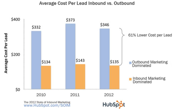
Investing in this kind of content has much better returns, not just from the raised visibility standpoint, but also for conversions and cost per acquisition over time:

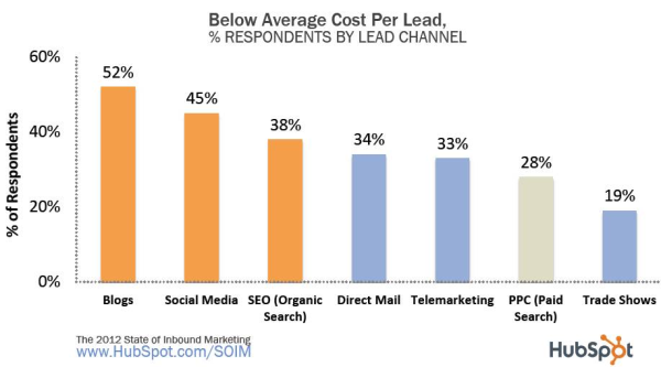
Maybe more importantly, blogging was rated the cheapest inbound marketing method:

When I look at structuring content, I start with common FAQs in the industry and get a ballpark of competitiveness on content for a topic and because thinking in terms of and researching faqs is a great way to generate content ideas and a page that has the potential to attract links from other sites for being useful.
Looking at “mortgage faqs” in Google search results, I was surprised at the low competitiveness of the ranking results in terms of links.

Those metrics below each result look complicated, but just to focus on the “RD” metric, or number of linking root domains for the results, they’re relatively low ranging from 0 to 5 sites linking to the respective faqs pages (I’m not including mortgagenewsdaily.com because their FAQs page’s backlink profile is incredibly unnatural and low quality.)
In addition I looked at the FAQs pages for the top couple results and noticed that they are predominantly bank-specific or product-specific questions and typically 10 to 50 questions and answers. I’d see this as a opportunity for creating a monster list of a general mortgage faqs page that deserves to rank above those pages with more and better answers to questions people are asking.
How to Build a Monster FAQs Page
To get a list of questions people type into search engines, I use a tool called ubersuggest. This scrapes the google suggestion box data. By running possible suggestions for questions like “how do/can i make my mortgage…” I can start to see what people are actually asking related to your vertical:
how can i make my mortgage payments lower
how late can i make my mortgage payment
how can i make money from my mortgage
how do i make my mortgage interest tax deductible
how do i make my mortgage tax deductible
how to make my mortgage affordable
how to make my mortgage cheaper
how to make my mortgage tax deductible
how can i make my mortgage payment with a credit card
how can i make my mortgage payment at a bank branch
how can i make my mortgage payment weekly
As you can see with hundreds of these questions scraped, they can be categorized and refined into the root questions people are asking. And since most answers are only a couple lines, there’s an opportunity to provide more content, with graphics and link resources for more information. Will this alone make you rank better for those questions? Probably not, but deserving to rank higher from a content perspective is the first step and it’s also a useful component to your users who aren’t ready to get a quote.
Hope this was helpful, Joe. If you came across this post by chance, feel free to comment or check my site reviews section to see actionable tips for site reviews as they’re posted in the future.